Bornicon & Salming
Animation cartoon
Bornicon & Salming (now The Wine & Spirits Collective) is a wine wholesaler and importer in Sweden.
The company wanted something on their website, while a section whas updated. The idea was an impatient glass that couldn’t wait for the update, and then took action it self.
The animation was made the old Disney way, by hand drawings on sheets of paper on top of each other, before they were digitized.
Isodor
Visual identity
Logotype
Animation
Printed matter
Isodor is a specialist in chimney solutions. The challenge was to modernize the company's profile and visual expression, and to strengthen their position and awareness on the market.
The company had a background in the chimney sweeping industry, and had started to manufacture tailor-made chimneys for the industry and private individuals. They also developed a method to solve soot problems and making older masonry chimneys more efficient, through a unique internal molding method.
The idea was to merge the company's work area, with their name in a logotype. Furthermore the design was done in a way, that radiate their uniqueness and strength in the field.
Selected logos
Logos / Logotypes / Visual identities
EO Kommunikation (communication agency)
Wire Snake (product)
Isodor (chimney solutions)
Meet The Danes (tourist bureau)
Danish-American Business Forum
Visual identity
Trademark
Animation
Printed matter
The Danish-American Business Forum (now part of AmCham) is a member based non-profit network for Danish companies, that provided assistance to each other and help from experts, to tackle the American market.
The organization wanted a trademark that could illustrate the organizations function and work. The job also included design of various printed matter.
The creative process was an exploration on connections across the Atlantic, the star as a symbol for the US, growing diagram curves symbolising growth and success, and high-fives between business people.
Luxo anniversary posters
Posters
Animation
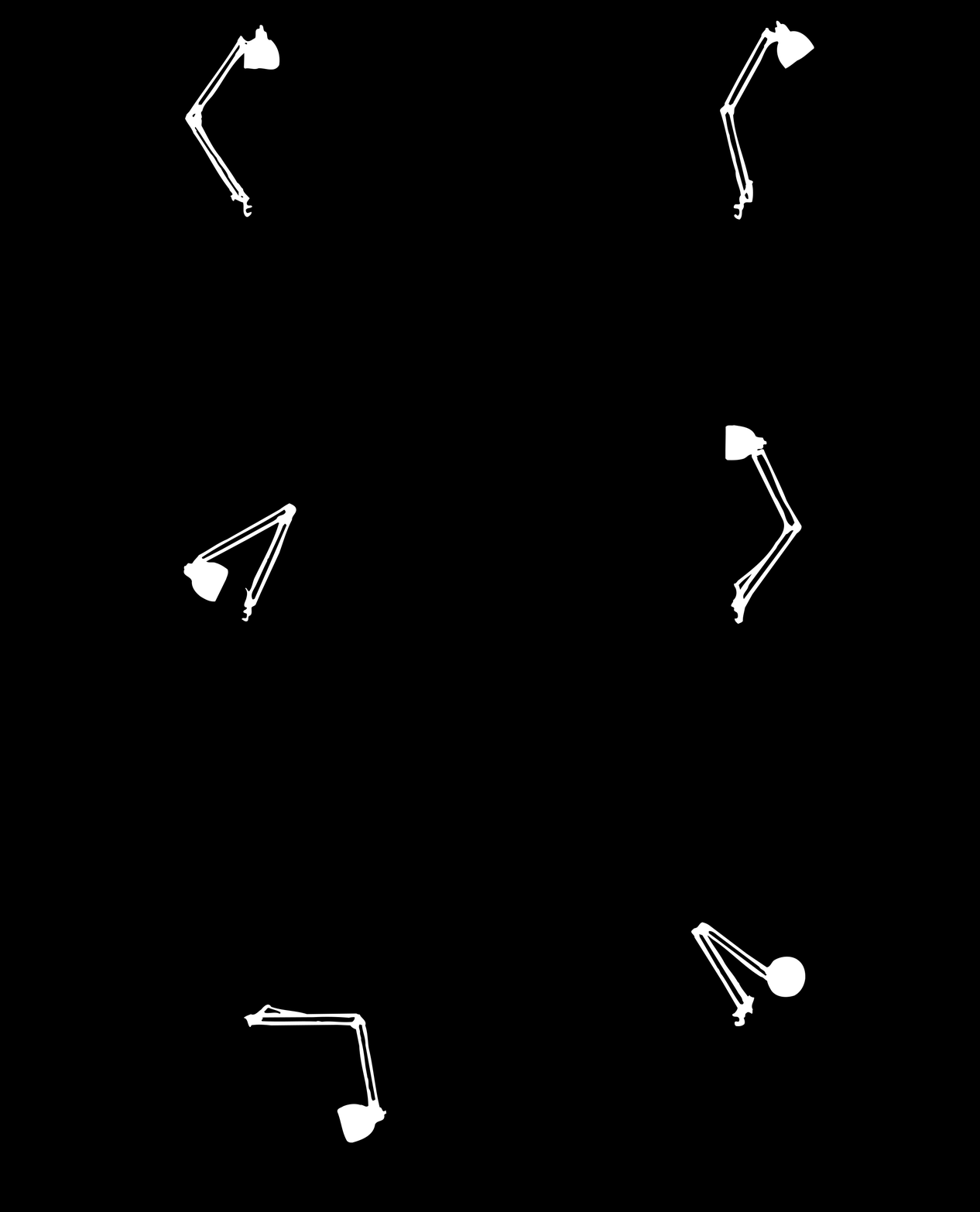
60th anniversary posters for the classic Luxo lamp. First prize in a design competition held by Luxo Denmark.
Luxo wanted a poster to illustrate the lamp's 60th anniversary, with an emphasis on the lamp's light and flexibility. The idea was 60 lamps in different positions, one for each year. And inspired by the animation "Junior" by Pixar, the lamps were brought to life by imagining them study each other, in the occasion of the anniversary.
The posters were screen printed (serigraphic) in the two different versions that was proposed, using the contemporary colours of the lamp (black, white and silver). Both posters were sent out to architects, among others.
